Lemmary is a production management dashboard I built for small makers, businesses that sell physical goods on Squarespace, Shopify, or Etsy and need to plan production around their orders. It pulls live order data from the storefront, joins it against a bill of materials, and rolls up a daily picture of revenue, lead time, materials demand, and which production stages are slowing things down.
Most of the work was figuring out how to model orders generically across multiple e-commerce platforms, then pull useful signals out of the data. It started as an automated AWS pipeline for a single store (covered in the Sälka case study), then grew into a full product.
1. Platform-Agnostic Schema with an Adapter Layer
The Problem
Lemmary supports orders from multiple e-commerce platforms, currently Squarespace, with Shopify and Etsy on the roadmap. Each platform exposes orders in its own shape: different field names, different nesting, different ways of representing variants and discounts. The rest of the app (BOM matching, materials report, workflow kanban) shouldn’t have to know where an order came from.
The Schema
Three core tables, normalized into a shared shape:
-- stores
id              UUID PRIMARY KEY,
user_id         UUID REFERENCES auth.users,
platform        TEXT CHECK (platform IN ('squarespace', 'shopify', 'etsy')),
store_name      TEXT,
api_key         TEXT,
platform_config JSONB

-- orders
id                  UUID PRIMARY KEY,
store_id            UUID REFERENCES stores,
platform_order_id   TEXT,           -- original ID from the platform
order_number        TEXT,
customer_name       TEXT,
customer_email      TEXT,
order_date          TIMESTAMPTZ,
fulfillment_status  TEXT,
subtotal            NUMERIC,
grand_total         NUMERIC,
promo_code          TEXT,
discount_total      NUMERIC

-- order_items
id              UUID PRIMARY KEY,
order_id        UUID REFERENCES orders,
platform_sku    TEXT,
product_name    TEXT,
variant_label   TEXT,
quantity        INTEGER,
unit_price      NUMERIC
platform_config is JSONB so platform-specific quirks (API versions, base URLs, regional settings)
don’t require schema changes when we add Shopify and Etsy.
The Adapter Layer
Each platform has its own service that fetches orders and normalizes them into the shared shape:
// server/routes/orders/platforms/squarespace.ts
export async function fetchSquarespaceOrders(store: Store): Promise<NormalizedOrder[]> {
  const raw = await squarespaceClient.listOrders(store.api_key);
  return raw.map(normalizeSquarespaceOrder);
}

function normalizeSquarespaceOrder(raw: SquarespaceOrder): NormalizedOrder {
  return {
    platformOrderId: raw.id,
    orderNumber: raw.orderNumber,
    customerEmail: raw.customerEmail,
    orderDate: new Date(raw.createdOn),
    subtotal: Number(raw.subtotal.value),
    grandTotal: Number(raw.grandTotal.value),
    promoCode: raw.discountLines?.[0]?.promoCode ?? null,
    discountTotal: Number(raw.discountLines?.[0]?.amount?.value ?? 0),
    items: raw.lineItems.map(normalizeLineItem),
  };
}
Adding a new platform = writing a new adapter that returns the same NormalizedOrder shape.
Everything downstream stays the same. The shared shape only carries what the analytics queries need.
2. Dynamic Time Bucketing
The Problem
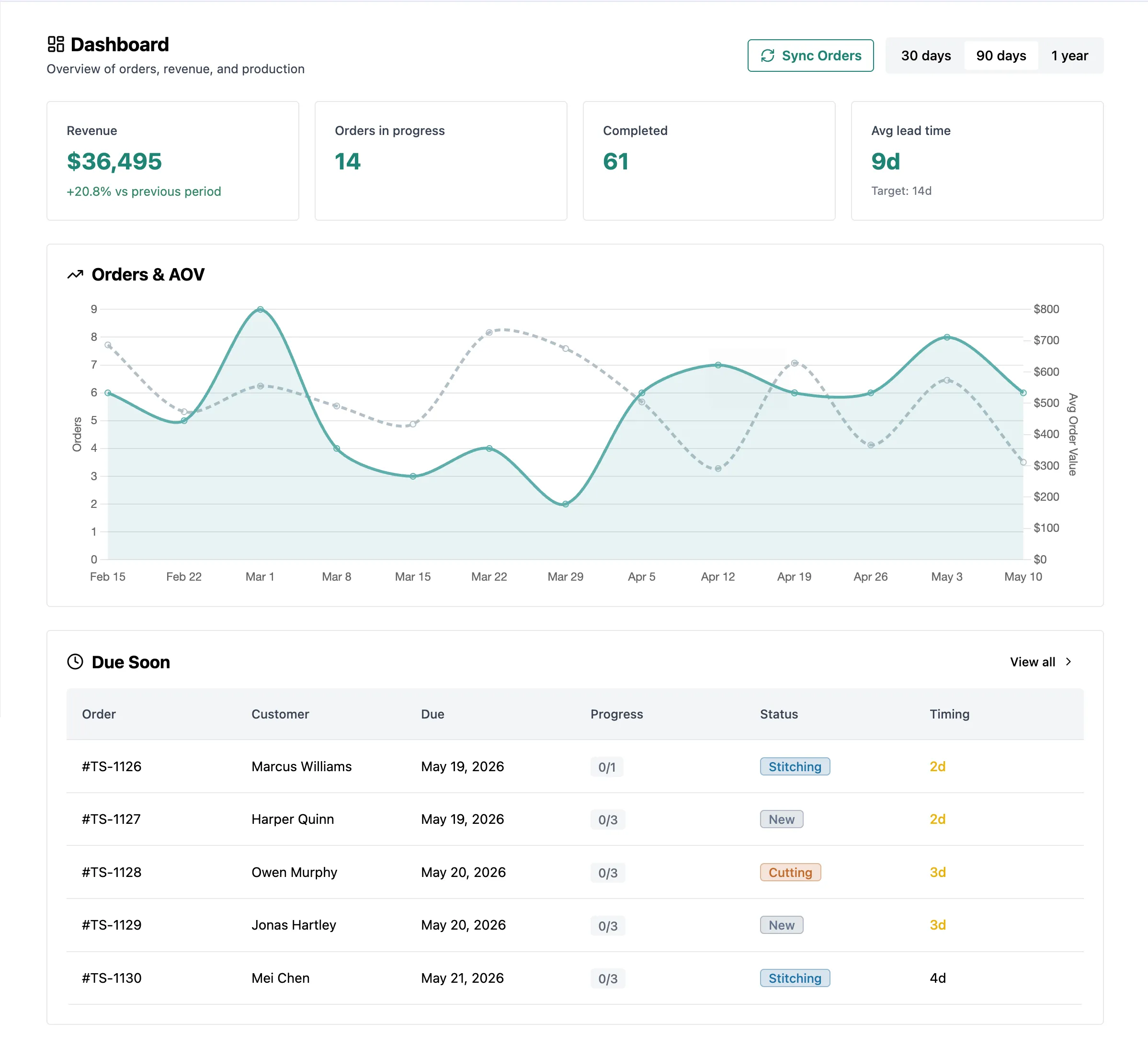
The KPI dashboard supports three date ranges: 30 days, 90 days, and 365 days. Each one needs a different time bucket for the orders trend chart:
- 30 days → daily points (30 dots)
- 90 days → weekly points (~13 dots)
- 365 days → monthly points (12 dots)
Picking the bucket in SQL keeps the bucketing logic in one place instead of branching across the API or the frontend.
The Pattern
type OperationsBucket = 'day' | 'week' | 'month';

const bucketForRange = (range: 30 | 90 | 365): OperationsBucket => {
  if (range === 30) return 'day';
  if (range === 90) return 'week';
  return 'month';
};
Then the query passes that bucket into date_trunc():
-- bucket is 'day', 'week', or 'month' depending on the requested range
SELECT
  to_char(date_trunc('day', order_date), 'YYYY-MM-DD') AS date,
  COUNT(*) AS count,
  COALESCE(SUM(subtotal), 0) AS revenue
FROM orders
WHERE store_id = $1
  AND order_date >= $2
GROUP BY date_trunc('day', order_date)
ORDER BY date ASC
The same query handles all three ranges. Only the bucket value changes.
Why This Matters
Passing the bucket as a parameter keeps the bucketing flexible. The frontend sends a range and gets back data already aggregated to the right level.
3. Stage Bottleneck Analysis with LEAD()
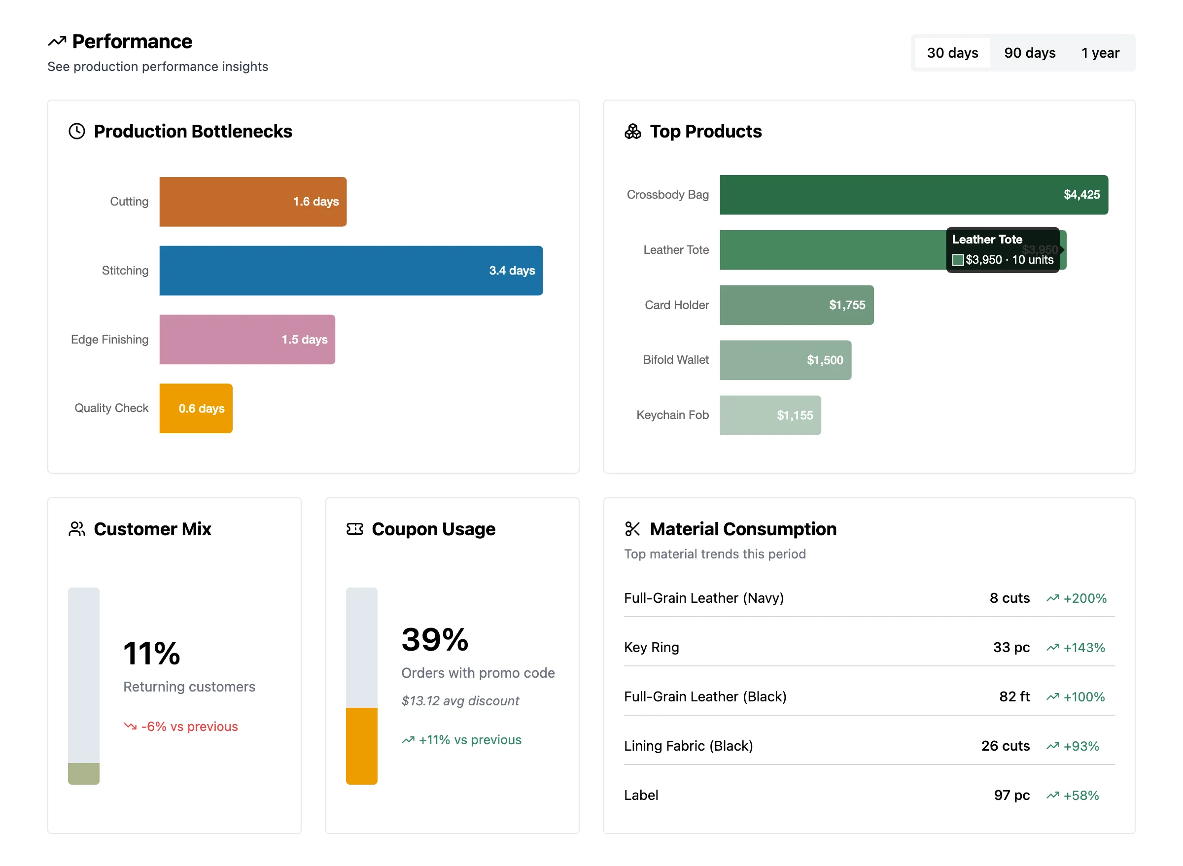
The Problem
Lemmary has a kanban-style workflow with customizable production stages (Order Placed → Cutting →
Sewing → Packed → Shipped, or whatever the store sets up). Every time an order moves between stages,
a row gets written to order_stage_history. Owners want to know: which stage is slowest?
The Pattern
WITH transitions AS (
  SELECT
    h.to_stage_id,
    h.transitioned_at,
    LEAD(h.transitioned_at) OVER (
      PARTITION BY h.order_id
      ORDER BY h.transitioned_at
    ) AS next_transition_at
  FROM order_stage_history h
  INNER JOIN orders o ON o.id = h.order_id
  WHERE o.store_id = $1
)
SELECT
  s.name AS stage_name,
  AVG(EXTRACT(EPOCH FROM (t.next_transition_at - t.transitioned_at))) AS avg_seconds,
  COUNT(*) AS transition_count
FROM transitions t
INNER JOIN order_workflow_stages s ON s.id = t.to_stage_id
WHERE t.next_transition_at IS NOT NULL
GROUP BY s.id, s.name, s.position
ORDER BY s.position ASC
LEAD() grabs the next transition for each order, partitioned by order. The difference between
consecutive timestamps is the total time the order spent in that stage. Filtering on
next_transition_at IS NOT NULL drops the rows where the order is still in its current stage, and
there’s no next transition to measure against yet.
4. Period-Over-Period with FILTER and CTEs
The Problem
Every dashboard card shows the current period and a delta against the prior period: revenue up 12% vs. last 30 days, for example. Doing this naively means two separate queries per card (current period, prior period) and a third query for anything that spans both, like customer mix.
FILTER for Conditional Aggregates
For metrics that boil down to counts and sums, Postgres’s FILTER clause buckets aggregates in a
single pass:
SELECT
  COUNT(*) FILTER (
    WHERE order_date >= NOW() - ($1 || ' days')::interval
      AND promo_code IS NOT NULL
  ) AS current_with_promo,
  COUNT(*) FILTER (
    WHERE order_date >= NOW() - ($1 || ' days')::interval
  ) AS current_total,
  COUNT(*) FILTER (
    WHERE order_date >= NOW() - ($1 * 2 || ' days')::interval
      AND order_date < NOW() - ($1 || ' days')::interval
      AND promo_code IS NOT NULL
  ) AS prior_with_promo,
  COUNT(*) FILTER (
    WHERE order_date >= NOW() - ($1 * 2 || ' days')::interval
      AND order_date < NOW() - ($1 || ' days')::interval
  ) AS prior_total
FROM orders
WHERE store_id = $2
One pass, four numbers, both periods. The frontend gets everything it needs to render a card with a delta arrow.
CTEs for Reusable Lookups
For something like new-vs-returning customers, the “first order date per customer” is the same regardless of which period you’re counting. Pulling it into a CTE means computing it once and joining against it twice (current period, prior period):
WITH customer_first_order AS (
  SELECT customer_email, MIN(order_date) AS first_order_date
  FROM orders
  WHERE store_id = $1 AND customer_email IS NOT NULL
  GROUP BY customer_email
),
current_repeat AS (
  SELECT DISTINCT o.customer_email
  FROM orders o
  INNER JOIN customer_first_order cfo USING (customer_email)
  WHERE o.store_id = $1
    AND o.order_date >= NOW() - ($2 || ' days')::interval
    AND o.order_date > cfo.first_order_date
)
-- prior_repeat CTE follows the same pattern, shifted by one range
SELECT
  (SELECT COUNT(*) FROM current_repeat) AS current_returning,
  ...
Same idea: fewer round-trips and simpler API code.
5. Low-Baseline Smoothing for Ranking
The Problem
The materials trend card shows which materials saw the biggest change in consumption
period-over-period. The obvious sort is by percent change: (current - prior) / prior. That breaks
on small-business data, which is the target use case.
Going from 1 yard of webbing last month to 3 yards this month is a 200% jump. Going from 50 yards to 80 yards is a 60% jump. The percent-change sort puts the 1→3 row at the top, which is technically correct but useless for planning: three yards of webbing isn’t a signal anyone needs to act on.
The Pattern
Adding 1 to the bottom of the percent change calculation pulls the small baselines back without changing big numbers much:
ORDER BY (current_qty - prior_qty) / (prior_qty + 1) DESCFor prior_qty = 1: adding 1 makes the percent change roughly half as big. For prior_qty = 50:
adding 1 barely moves the number.
The 50→80 row moves up; the 1→3 row drops down. The frontend uses the same formula for the displayed delta so the sort order matches what users see.
// Same formula on the client so the rank order is consistent with the label
const smoothedDelta = (current - prior) / (prior + 1);
const percentLabel = `${Math.round(smoothedDelta * 100)}%`;
Why Not Just Filter Out Small Baselines
Filtering (say, “only rank materials where prior_qty >= 10”) works but loses information for
stores that genuinely have low volume. A small-business user might only do 20 orders a month. A
threshold that makes sense at 200 orders excludes them entirely.
The +1 trick works across volume levels: small stores see useful rankings, big stores see the same.
6. Anomaly Annotations on the Orders Trend
The Problem
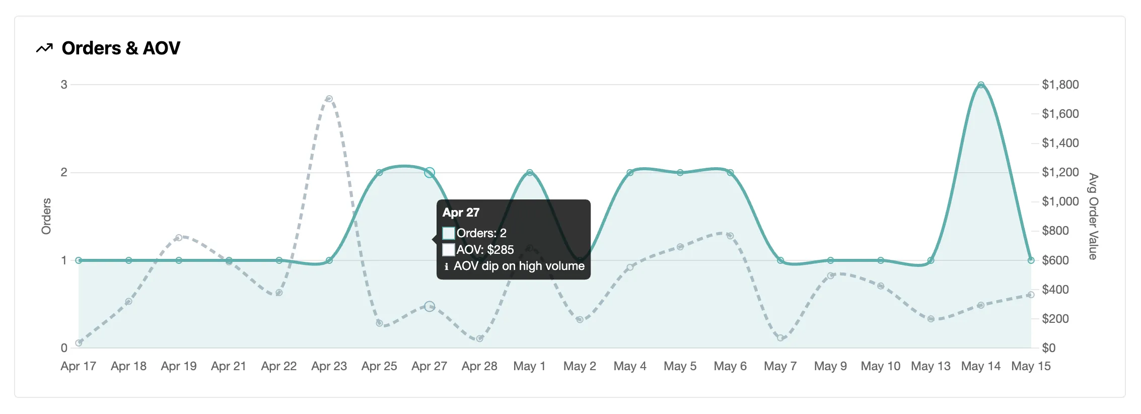
The orders trend chart shows daily (or weekly, monthly) order counts as dots on a line. A day with 1 order at $5,000 looks the same as any other dot. So does a day with 50 orders at $20 each. Both are unusual: one is probably a big bulk order, the other a sale or promo. But nothing in the chart flags them on its own.
The goal: catch those moments and show them in the tooltip so the store owner notices without having to study the chart.
The Pattern
Two pure functions. One gets the period averages, the other flags individual points against them:
type AnomalyType = 'spike' | 'dip' | null;

const LOW_RATIO = 0.7;
const HIGH_RATIO = 1.3;

export const generatePeriodStats = (points: TrendPoint[]): PeriodStats => {
  const totalOrders = points.reduce((sum, p) => sum + p.count, 0);
  const totalRevenue = points.reduce((sum, p) => sum + Number(p.revenue), 0);
  const activeDays = points.filter((p) => p.count > 0).length;

  return {
    avgOrdersPerDay: activeDays > 0 ? totalOrders / activeDays : 0,
    avgAov: totalOrders > 0 ? totalRevenue / totalOrders : 0,
  };
};

export const detectAnomaly = (point: TrendPoint, stats: PeriodStats): AnomalyType => {
  if (point.count === 0) return null;
  if (stats.avgOrdersPerDay === 0 || stats.avgAov === 0) return null;

  const orderRatio = point.count / stats.avgOrdersPerDay;
  const aovRatio = Number(point.avgOrderValue) / stats.avgAov;

  if (orderRatio < LOW_RATIO && aovRatio > HIGH_RATIO) return 'spike';
  if (orderRatio > HIGH_RATIO && aovRatio < LOW_RATIO) return 'dip';
  return null;
};
Instead of just flagging a high value, it compares the order count and AOV:
- Spike: fewer orders than usual, but higher AOV → likely a single big order
- Dip: more orders than usual, but lower AOV → likely a sale or promo
The tooltip shows different copy depending on which one fires.
Why Period-Relative
The thresholds are 0.7x and 1.3x of the period average, not fixed values. An absolute “flag anything over $1,000 AOV” would miss spikes at higher-volume stores and constantly fire on smaller ones. Comparing against the period average scales to whatever the store’s normal looks like. Same idea as the +1 smoothing in section 5.
7. Data Quality
The Problem
Real order data isn’t always clean or complete. An ordered SKU might not have a matching bill-of-materials entry yet, a schema update can change the shape of a response, or a new store might not have enough history to compare against.
Handling It
A few checks keep data quality high:
- The materials report matches each ordered SKU against the bill of materials. If an order has a SKU
with no BOM entry, a plain inner join would drop it and the materials totals would come up short.
Those unmatched SKUs get returned in a separate
mismatcheslist next to the totals, so you can see the gap and fix it. - Every response gets checked against its Zod schema before it’s sent. If the shape drifts from what’s documented, it gets logged in production where it’s visible, so a bad query or schema change shows up in the logs instead of quietly reaching the dashboard.
- When there’s no prior period to compare against, the anomaly and delta math returns
0ornullinstead of dividing by zero, so a brand-new store sees a clean dashboard instead of broken numbers.
Demo Data
The demo’s sample data is reseeded nightly by a scheduled job, so order and due dates stay current instead of aging into a backlog of overdue orders.
Summary
Lemmary ended up being a series of small choices about how to read a not-very-large database in a
way that gives back useful signal. Schema-side, the adapter pattern made multi-platform support
manageable. Query-side, window functions, FILTER, dynamic
bucketing, and the smoothing trick added up to a dashboard that responds to small-business data the
way a small business actually needs.
The full app is at lemmary.com with a live read-only demo for visitors, no signup needed.