Project Introduction
This data analysis project explores U.S. federal debt trends using Excel’s advanced analytical capabilities including pivot tables, XLOOKUP functions, and exponential triple smoothing (ETS) forecasting. Working with historical debt data from 1993-2023, we examine three key research questions: yearly debt percentage changes during economic events, seasonal patterns in monthly debt accumulation, and projected growth trajectories for publicly held debt through 2027.
The analysis demonstrates proficiency in data cleaning techniques, conditional formatting for data validation, pivot table aggregation, and time series forecasting. Our dataset required significant preprocessing to handle inconsistent reporting periods and null values, particularly for data prior to 2005. Through systematic data manipulation and visualization, we identify crisis-driven debt spikes, seasonal spending patterns, and long-term debt growth projections.
Initial Data Cleaning
First, we kept our raw data intact and created a new sheet transposing the data to have our debt data in rows rather than columns. This is much more usable in pivot tables where each column would be identified (thousands of columns).
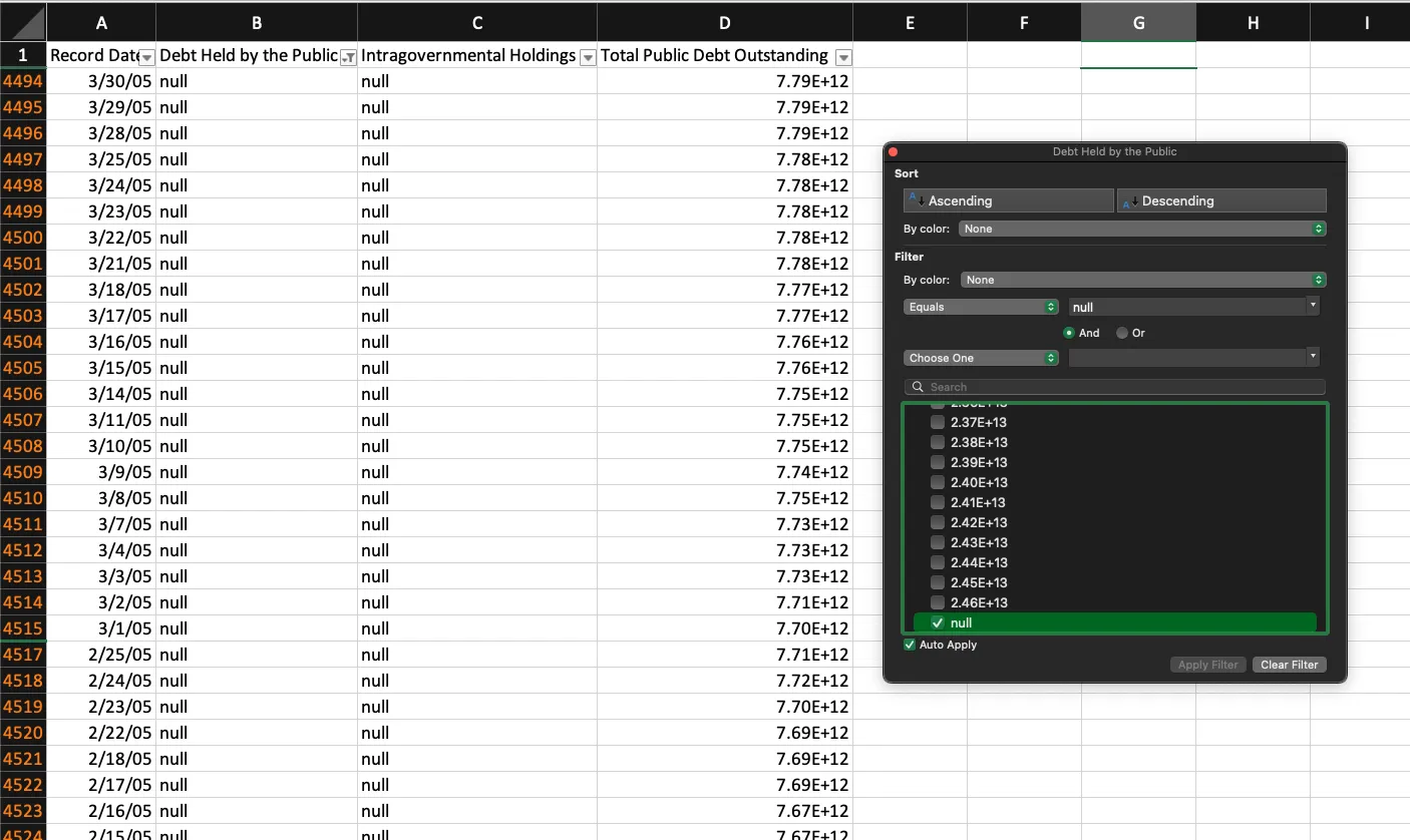
Taking an initial glance at our data, we can see data wasn’t consistently reported until
approximately 2005 for both Debt Held By Public and Intragovernmental Holdings. No ‘blanks’ or
other outliers were discovered during this process. However, null values or string “null” values
won’t help us work with numerical data. So we’ll remove “null” values and leave cells empty where no
data is found. This is also where we could change from scientific notation to numerical depending on
one’s preferences. With our data cleaned and properly formatted for analysis, we’ll dive into the
first question.
Yearly Debt Percentage Increase
Question for analysis: What was the Yearly Debt Percentage Increase for each year compared to the previous year?
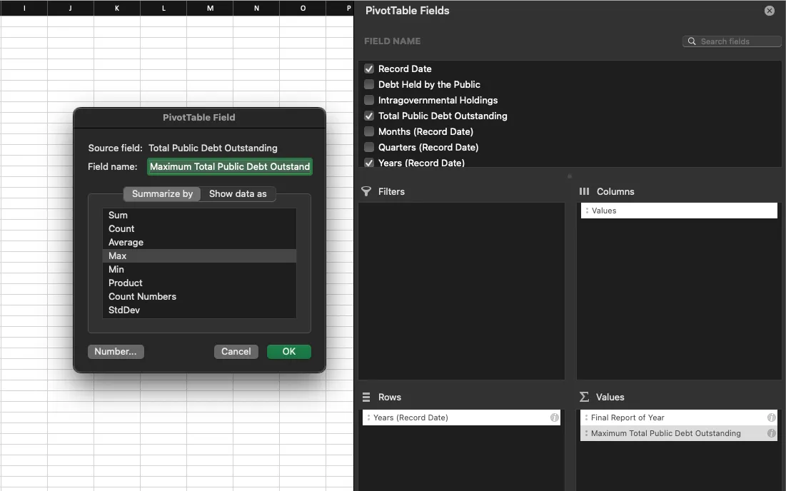
For this first question, we’ll create a pivot table in a new sheet to filter our data to the final reported debt per each year. We don’t want to assume that this would always be reported on a specific date like 12/31/YY. So with Record Date filtered down to year used as our row values, we can add columns to show the maximum date reported per year (or latest report), as well as the maximum debt value for the given year. We’ll also filter out 2023 data since it’s partial and only has data through February 2023.
Formula for pulling in the Total Public Debt Outstanding value by date lookup in the Record Date
column in the cleaned data sheet:
=XLOOKUP(C9,'Cleaned Data'!A:A, 'Cleaned Data'!D:D)While debt is likely to continually increase, there’s also a chance the highest debt value each year happens sometime earlier in the year. I’ll choose to go with the final reported date’s debt value for consistency. Depending on the needs of a report, perhaps it would be more interesting to look at the highest overall value per year instead of using the final reported data (often in late December). I’ve added some conditional highlighting to showcase the few data points with discrepancies.
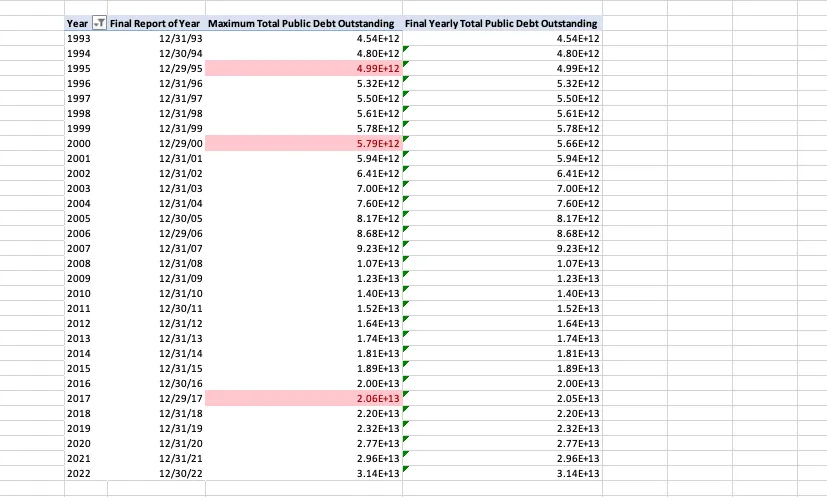
Conditional formatting to highlight values that do not match:
=$D6<>$E6With our accurate total debt per year calculated, we can now calculate the percentage increase year
over year using a formula: =((E6-E7) / E7) (sorted descending) and formatting the column or table
values to a percentage. We can see a surprising debt decrease (1.97%) in 2001 and a big debt spike
(19.6%) in 2020, most likely due to COVID.
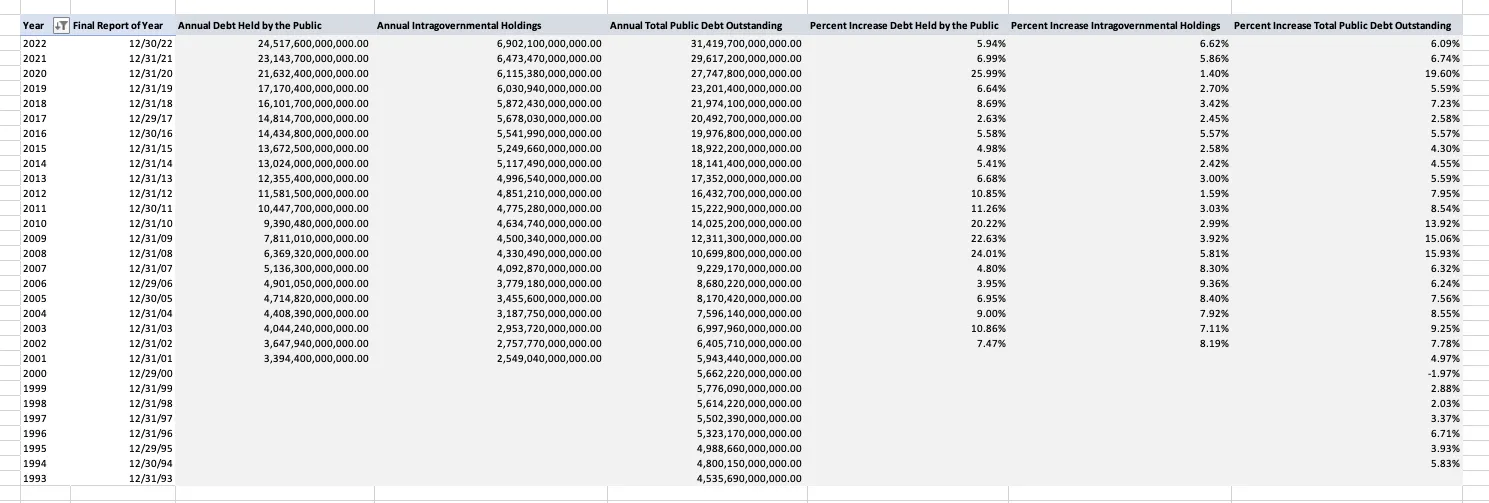
Having calculated the annual Total Public Debt Outstanding and percent change year over year, we
applied this same formula to our two remaining columns Debt Held by the Public and
Intragovernmental Holdings.
=XLOOKUP(C9,'Cleaned Data'!A:A, 'Cleaned Data'!B:B)
=XLOOKUP(C9,'Cleaned Data'!A:A, 'Cleaned Data'!C:C)
With our data and percentages now in place, we can create a visualization to demonstrate the yearly debt percentage change:
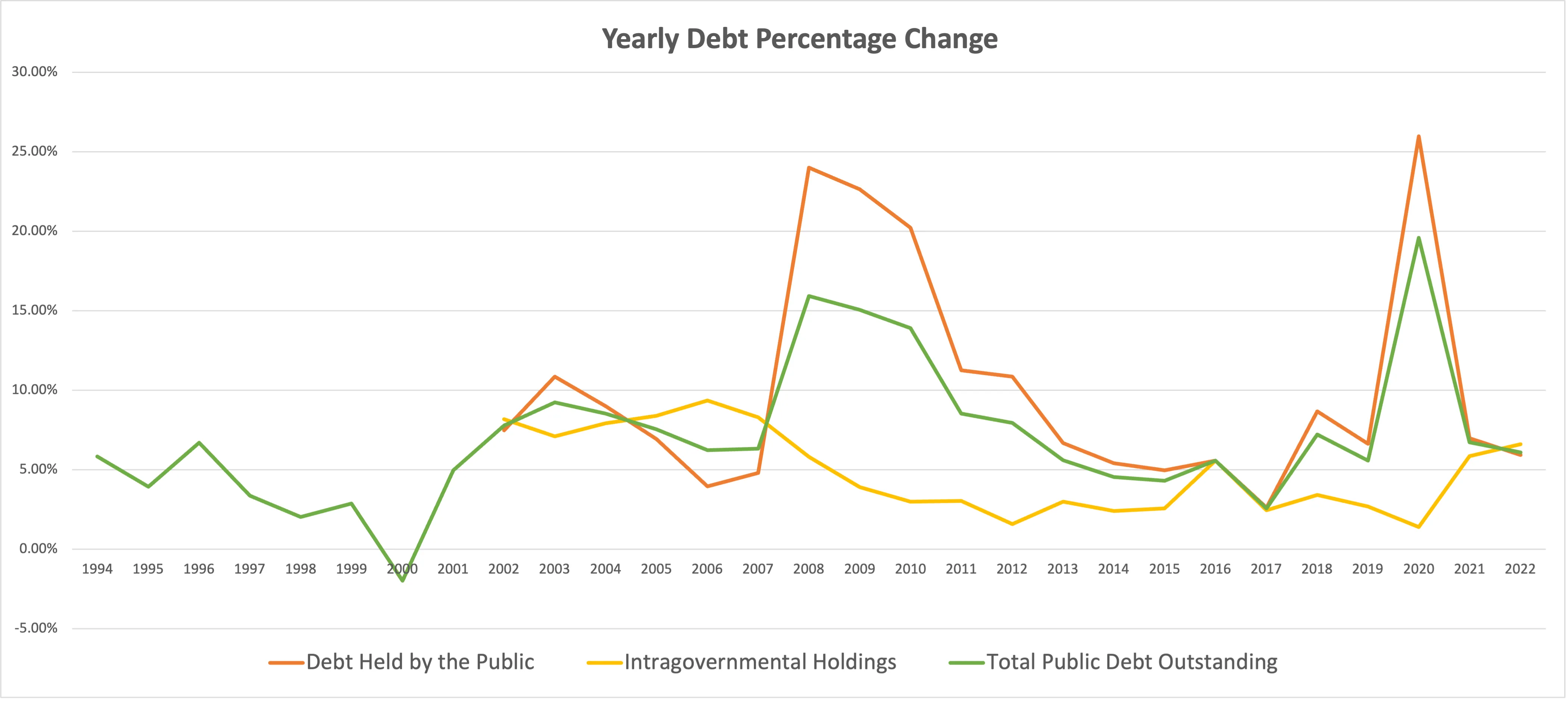
Summary/Conclusions: The chart shows three major spikes in debt growth that align with economic crises: the 2008 financial crisis, and the 2020-2021 pandemic period which saw the largest increases with debt held by the public jumping over 25%. Outside of these crisis periods, annual debt growth typically stayed in the 2-8% range across all categories. The data reveals that debt held by the public is the most volatile component, while intragovernmental holdings remain relatively stable throughout the timeframe.
Historical Monthly Total Debt Averages: Highs & Lows
Question for analysis: Which months historically have seen the highest/lowest increases in Total debt?
Looking at our cleaned data, we need to aggregate based on month to look at our historical averages. We’ll set up a pivot table with our Record Month for our row and our average Total Debt Outstanding for our values. For simplicity here, I kept it in scientific notation but we can easily format the value in our pivot table if needed.
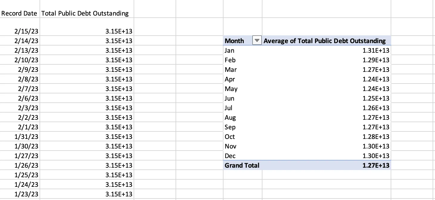
This question requires less data manipulation, so we can rely instead on aggregating data in our pivot table. When copying over the cleaned data, I removed the Debt Held by the Public and Intragovernmental Holdings to focus on total debt averages. Let’s look at our final data visualization:
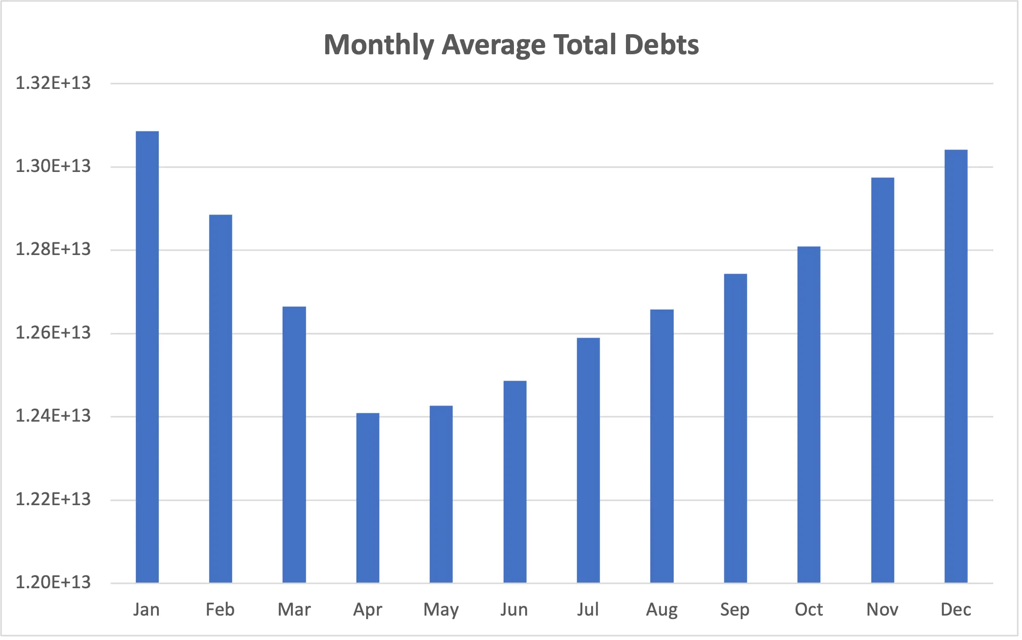
Summary/Conclusions: Highest monthly debt increases historically occur during November, December, and January. While lowest monthly debt increases occur during April, May, and June. For U.S. debt data, we can hypothesize that higher debt averages in November-January are caused in part by holidays and increased spending. While April-June appears to put less economic pressures on spending.
Projected Growth of Publicly Held Debt
Question for analysis: What is the projected growth of the publicly held debt in the next few years?
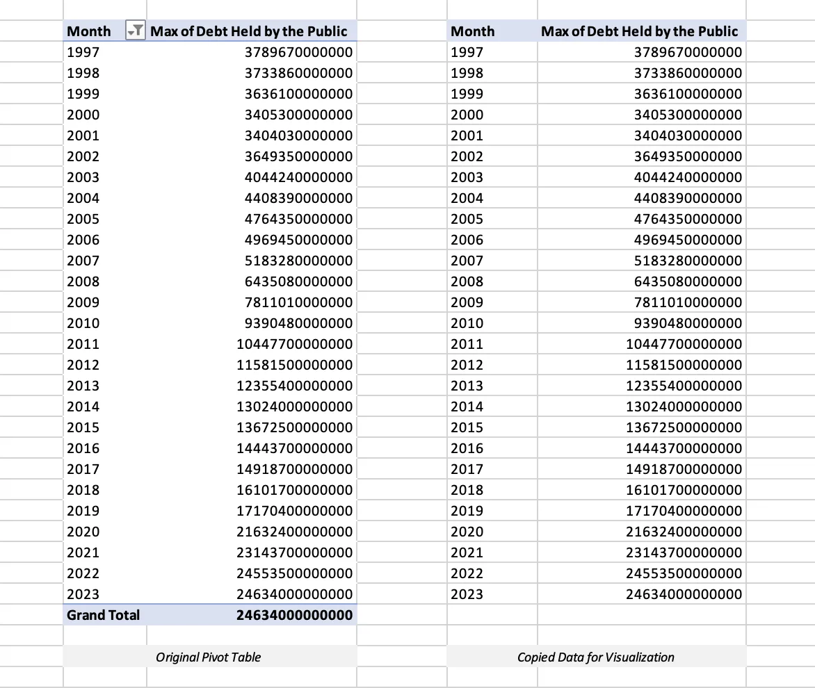
For the sake of demonstration and exploring the forecasting abilities within Excel, we’ll start by creating a pivot table to look at the maximum recorded debt per year within our existing data. We’ll be sure to filter out 1993-1996 where we have no existing data for the Debt Held by the Public column.
Then we can introduce our forecast using the exponential triple smoothing (ETS) forecast function for years 2023-2027:
=FORECAST.ETS(E30,$F$3:$F$29,$E$3:$E$29)I kept the data anchored to real reported values so we don’t lose the accuracy of our forecast by including new “forecasted” results in our formula. We’ll also exclude the 2023 result since it’s considered partial for this dataset (last recorded value in Q1 of 2023). For those curious, the actual total publicly held debt for 2023 was 26.3 trillion (source) and for 2024 (source) was approximately 29 trillion by end of fiscal year.
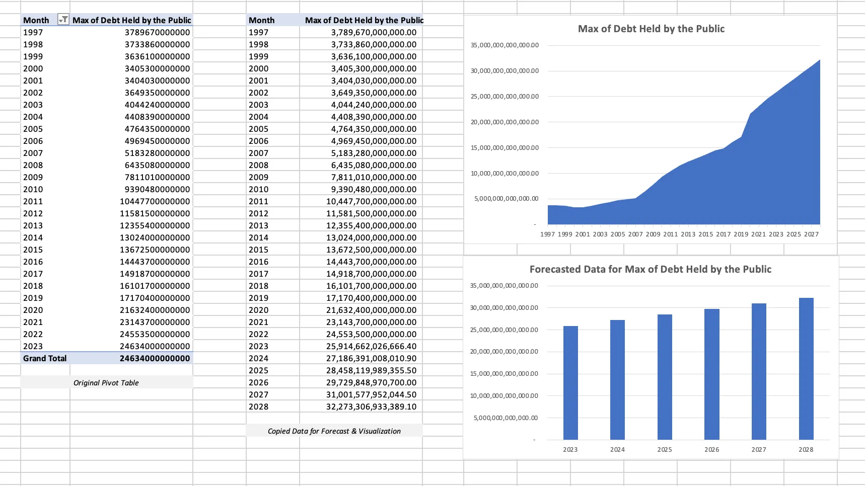
Summary/Conclusions: From 1997 - 2007, we saw an increase of about 1 trillion in publicly held debt. From 2008-2019, debt increased from 6 trillion to 17 trillion. From 2020-2022, debt increased 21.5 trillion to 25 trillion. From 2023-2027, the publicly held debt is forecasted to reach 33 trillion. In conclusion, publicly held debt is projected to increase at a steady-rate over the next 5 years.
Future Exploration
While that summarizes the three initial data analysis questions, as always, there are more ways we could extend this analysis to provide a broader and more accurate context for the United States debt and future projections. One could pull in concurrent data for the credit card reporting, the housing market, or even unemployment rates. One could also evaluate the volatility during major economic events.
You can find the final output of my analysis in the “Output” tab of my .xlsx file in the repo.